The essence of light in art museums lies in the holistic effect of the dynamic interplay among object, viewer, and illumination,
corresponding to:
"What to see" (original artwork),
"For whom" (target audience),
"How to see" (application of light).
When an original artwork is imbued with light,
it ceases to be wholly autonomous.
Light becomes an integral component co-creating a new work with the original,
affecting both the surface manifestation of the artwork in the gallery setting
and the viewer’s perception.
"How to see" constitutes secondary creation of visual art
through the synthesis of physical attributes, optical principles, and emotional resonance.
Our subjective intent is to enable viewers to more easily and distinctly
discern the essence embedded within the artwork.

Integrating the visions of the art museum, curator, and artist,
we employ light for secondary creation of visual art
with two intended outcomes:
1. Enhance the expressive power of the original artwork
2. Restore or maintain the expressive power of the original artwork.
Mayalit Lighting’s illumination is equivalent to a painter’s brush and a sculptor’schisel.
Prioritizing the original artwork,
we create visual art with spiritual connotation through:
"light’s form, light’s composition, light’s stroke,
light’s emotion, light’s quality."
First, Lighting Configuration: Determines the visual perception of the artwork and the spatial ambience of the gallery.
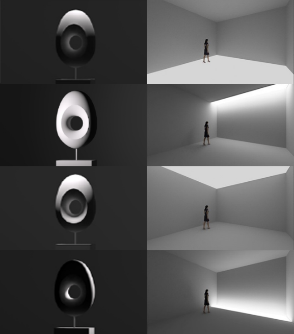
Gallery exhibitions are characterized by the periodic display of diverse works varying in type, form, and conceptual depth.
A gallery equipped with versatile lighting hardware can provide rich and flexible lighting configurations. This adaptability meets the demands of diverse exhibitions and enhances their expressive impact. For galleries, mere reliance on track lighting falls short of achieving true versatility. It is essential to integrate linear cove lighting and luminous surfaces, creating a combined artificial lighting system of points, lines, and planes. Where architecturally feasible, natural light should be maximally utilized in a controlled manner.
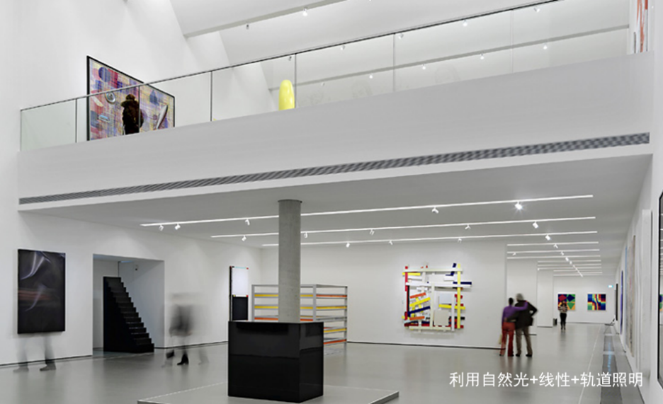
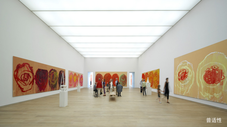
Lighting hardware construction standards are broadly categorized into two approaches: Flexibility-Oriented and Universality-Oriented.
Flexibility-Oriented: Requires a new interpretive presentation (a "secondary visual art creation") tailored for each exhibition. This demands exceptionally high professional expertise and comprehensive capability from the design team, resulting in substantial workload.
Universality-Oriented: Provides a single, unified interpretive presentation suitable for all exhibitions. This approach entails a relatively minimal workload.
Second, Light Composition: Determines the distribution and focal points within the viewer's visual field.
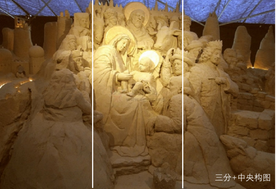
Based on the artwork's form, dimensions, material, technique, and placement within the gallery space – combined with our artistic intent – we employ various compositional approaches such as framing, triangular composition, and golden spiral. Two common approaches include:
1. Guiding Composition of Light: Directs the viewer's focus to the subject of the artwork through directional lighting, to enhance the artwork's rendering effect. The directional light-and-shadow visual composition brings a sense of mystery, reverence, and solemnity.
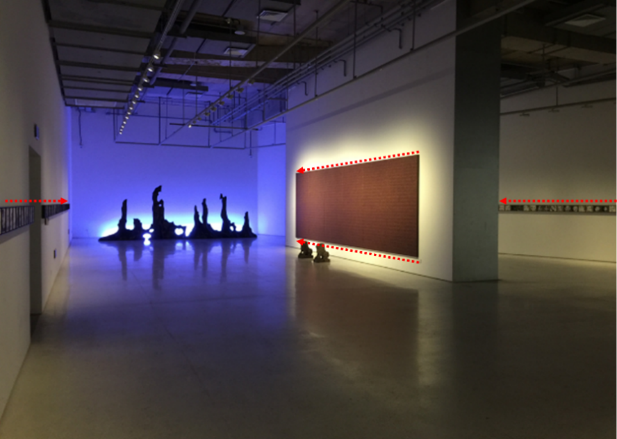
2.Minimalist Composition and Negative Space with Light: Creates a negative space through uniform, bright illumination, allowing the artwork to naturally stand out, to restore the artwork's rendering power effect. The minimalist visual composition brings comfort, modernity, and a sense of beauty.
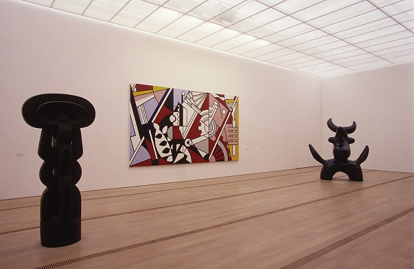
Third, Brushwork of Light: Determines the artwork's expressive strength and stylistic appeal.
Employing different lighting distributions is like using different brushes to depict the artwork's texture, sense of volume, and interplay of light and shadow. The thickness, intensity, direction, and shape revealed by this texture of light constitute the brushwork of light. It is not merely a technique, but more significantly reflects the creator's artistic style and personal sensibility.


Different brushwork of light yields distinctly different expressive effects on the same painting. While there is no absolute singular criterion in art, reinterpretation adheres to the principle of respect for the original work. The brushwork of light should align with that of the original artwork. Any approach that lacks, obscures, or distorts the original brushwork constitutes a failed reinterpretation.

Chinese art museums exhibit Chinese calligraphy and traditional paintings more frequently than their Western counterparts. The aspect ratios of these artworks' painting surfaces are standardized based on xuan paper sizes, categorized as follows:
For 3 to 8 foot full sheets (horizontal scrolls): 2:1
For vertical scrolls (couplets): 4:1
For square formats (doufang): 1:1
For larger formats (12 to 18 foot sheets): 2.5:1
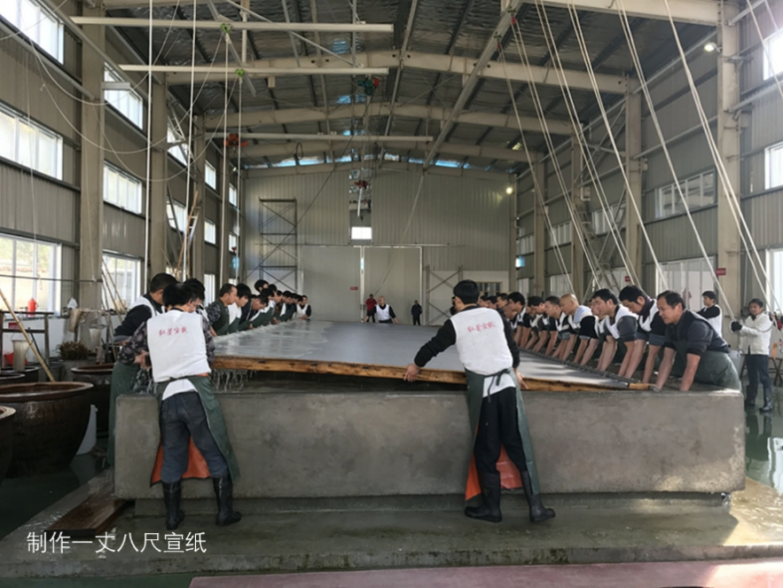
After mounting, the varying aspect ratios of artwork (excluding handscrolls) require stretched brushwork of light in more proportions for expression. This need is often overlooked by art museums and manufacturers, resulting in a lack of appropriate "tools" during creation. The compromised effects from makeshift solutions frequently prove inadequate.

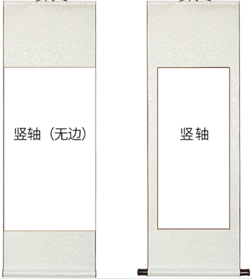
Mayalit Lighting has collected and systematized data on conventional dimensions of Chinese/Western artworks and gallery spatial scales. Based on this, it has developed and manufactured diverse "brushwork of light," offering customized "brushwork" services. Mayalit's magnetically attached "brushwork" enables swapping lighting distributions without changing luminaires, significantly enhancing operational flexibility while delivering substantial procurement cost savings for art museums.
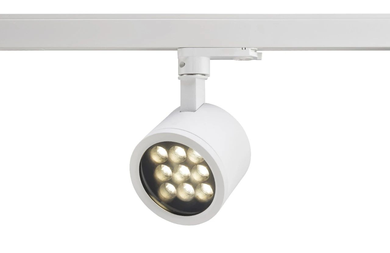
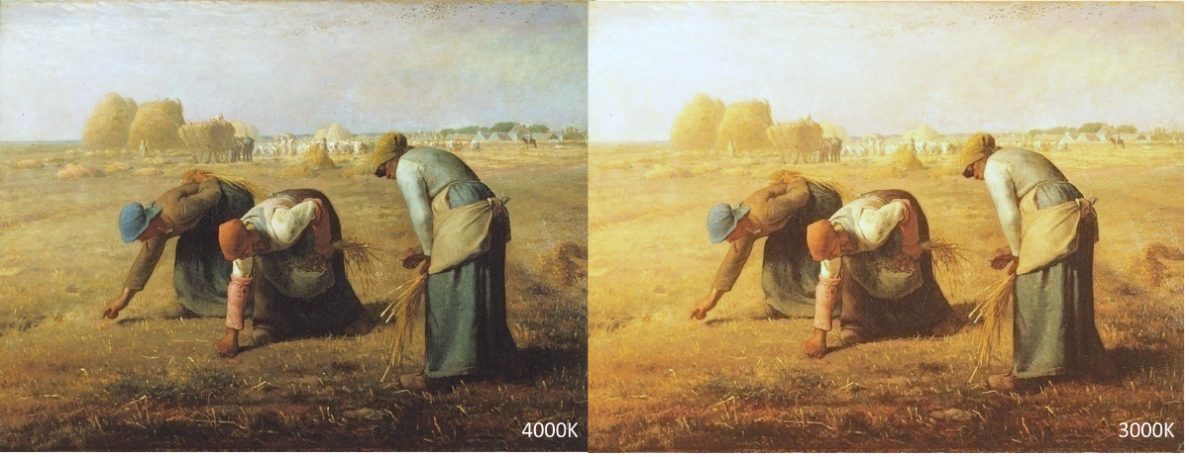
Forth, Emotional Tone of Light: Light with different colors and color temperatures influences the emotional tone of both the artwork and the space.
1. Artwork Emotion: To accurately express the artwork’s emotion, one must first understand its essence. Presumptive reinterpretation often contradicts the original work.
Jean-François Millet’s The Gleaners portrays the hardships of laborers and the toil of peasant life. The figures show no anger or complaint, only devout gathering of wheat—a piety akin to a silent outcry that shook the ruling class. At 4000K (left), this unexaggerated, calm realism resonates more profoundly than an impassioned emphasis on class struggle. Conversely, the 3000K rendition (right) conveys an erroneous emotional tone; its warm hues initially suggest joyous harvest.
Incorrect color temperature selection diminishes the artwork’s inherent artistic, historical, and cultural value.
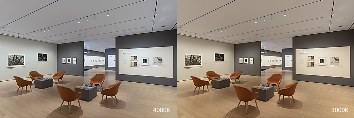
2. Under 4000K color temperature, the spatial mood atmosphere is more refreshing, people's mood maintains moderate excitement, metaphorically implying a fairness, which is the emotional gene formed in human evolution towards natural light; under 3000K color temperature, the spatial mood atmosphere is warmer, making people's mood relaxed, metaphorically implying an inclusiveness and nostalgia, it comes from the human emotional gene towards firelight.
Spatial color temperature will fix the emotional tone of people towards the entire exhibition, it will be transferred to the emotional perception of the works.
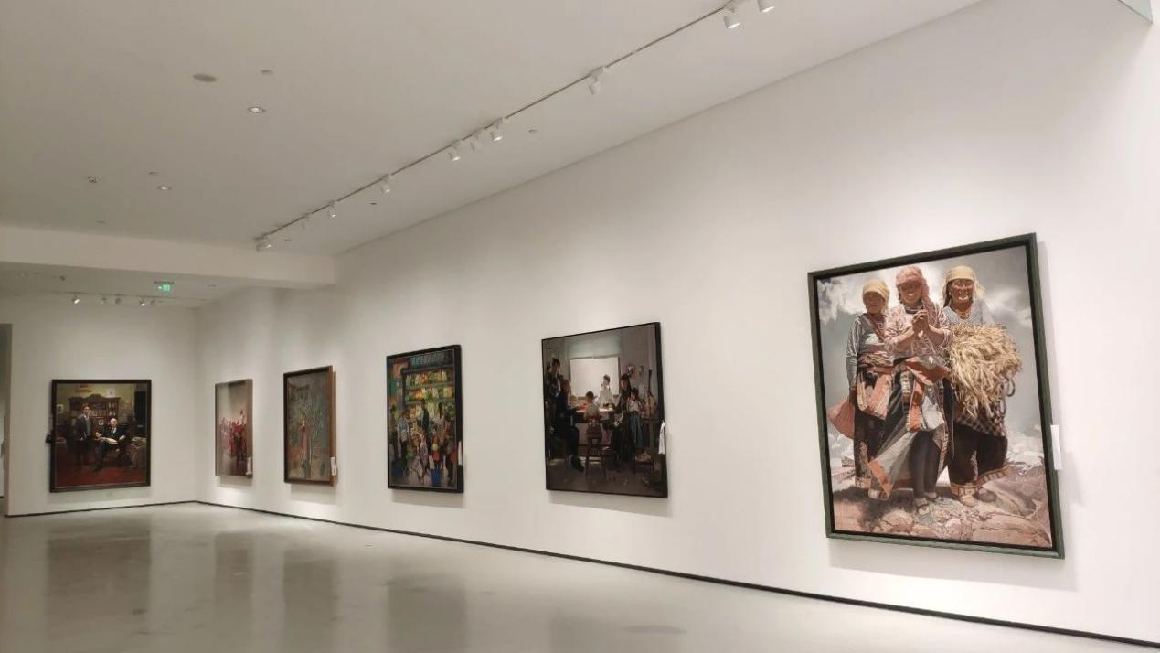
For comprehensive, multi-author exhibitions and contemporary art exhibitions, use neutral 4000K color temperature to create an open, parallel, universal spatial mood, avoid overly cold or warm color temperatures producing a spatial mood with obvious bias towards people, thereby affecting the perception of artistic diversity.
For exhibiting historical artifacts or traditional ink paintings/calligraphy, use warmer 3500K or 3000K color temperatures to create spatiotemporal consistency and convey traditional artistic spatial mood, allowing audiences to perceive solidity and simplicity, while preventing ink works from appearing frivolous under higher color temperatures.
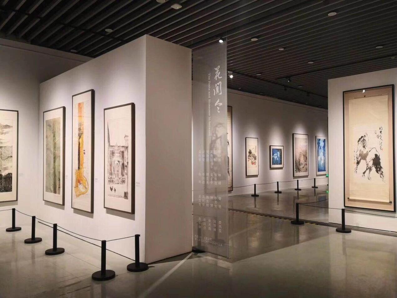
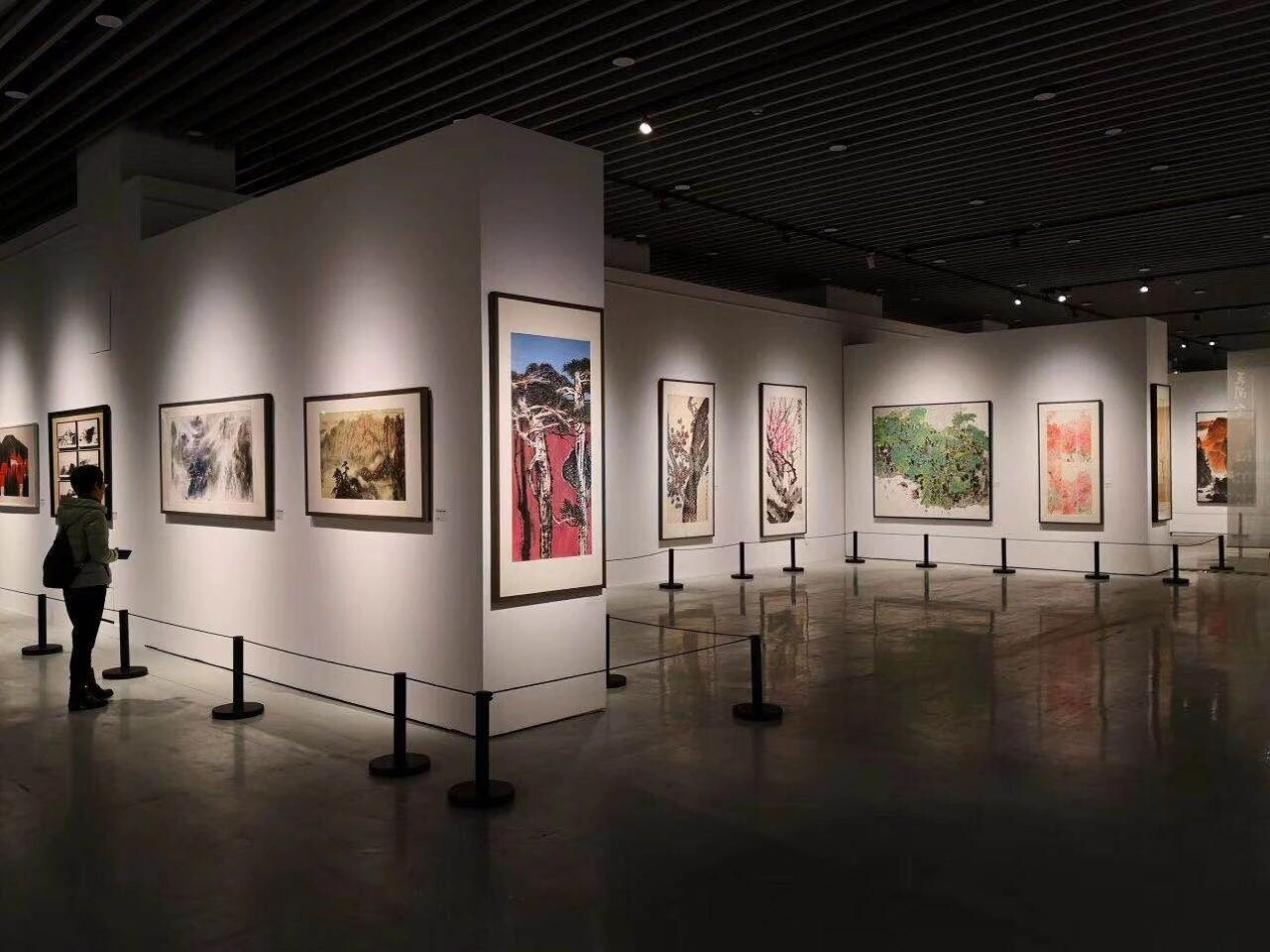
Contemporary art galleries should increasingly use adjustable-color-temperature lighting to create more precise and emotionally impactful atmospheres. This represents both a trend and progress. Mayalit lighting has developed and manufactures industry-leading adjustable-color-temperature smart products, enabling smooth color temperature transitions without altering color rendering. This technology is vital for art galleries.

Fifth, Light Quality: Determines the refinement of artworks after secondary creation by light.
Factors affecting light quality include glare control, size and fading gradient of secondary light spots, color rendition, and saturation.
Current color quality standards mainly include:
1.CRI
2.CQS
3.IES TM-30-15
1. CRI Standard:
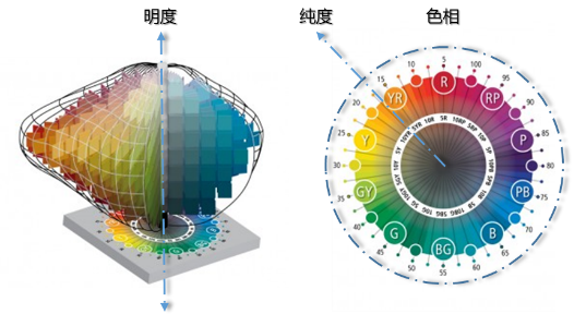
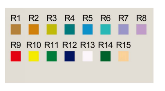
Selects 15 standard colors from the Munsell color system.
R1-R8: Medium lightness and chroma
R9-R15: Vivid colors and high chroma
Generally, the arithmetic mean of the first 8 color rendering indices is calculated: (R1+R2+...+R8)/8.
(Primarily used for color evaluation of gas-discharge light sources)
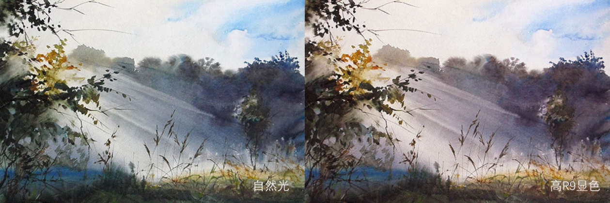
The advantages and disadvantages of R9: Due to the red compensation technology of LED light sources, which affects the color of the light, if the R9 index is overly emphasized, the light will tend to be pink.
Such enhancement is still acceptable in warm-toned or portrait works of figures.
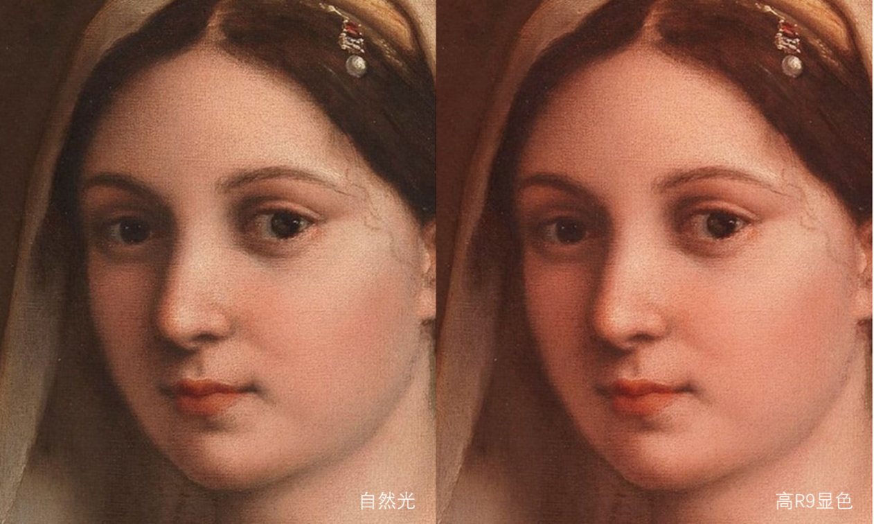
And for works with cold tones or natural landscapes, this is simply a disaster.
2.CQS (Color Quality Scale) Standard:
Selects 15 highly saturated, vivid colors within the visible spectrum and calculates the root mean square of the Color Rendering Index (CRI) for these 15 standard colors (Fig.1.png).
 Fig. 1
Supporting experimental data demonstrates that if a light source renders saturated colors well, its color rendering for non-saturated colors remains good. CQS more effectively represents color differences among similar hues and is better suited for color assessment of LED solid-state lighting sources.
3. IES TM-30-15 Standard:
Selects color samples from 105,000 real-world object colors, using 99 standard colors equally spaced across the visible spectrum (with equal sensitivity to all wavelengths).

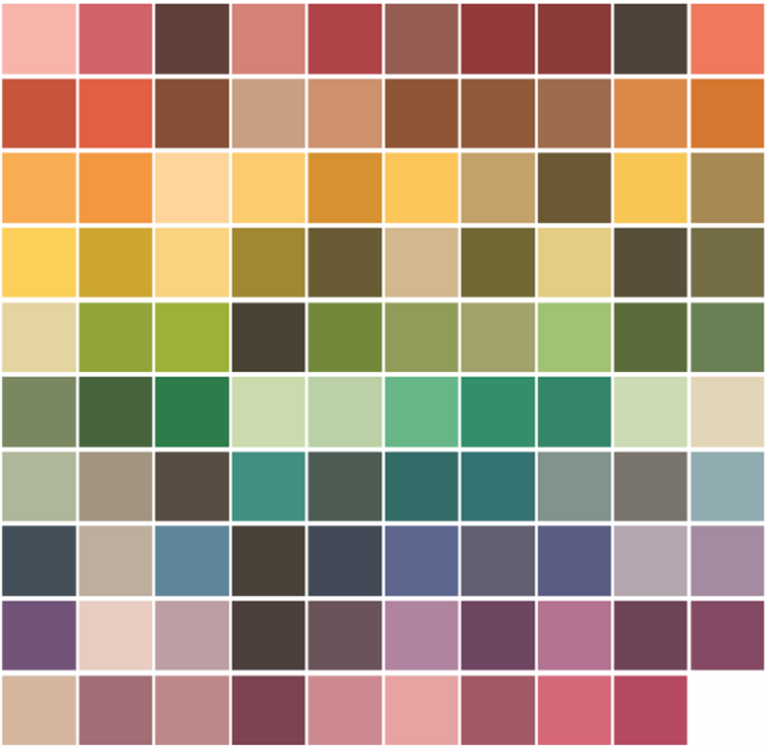
TM-30 dual metrics: Color Fidelity (Rf) and Color Gamut (Rg)
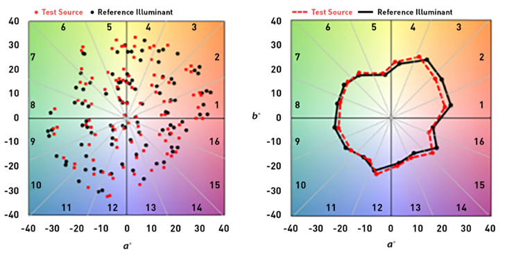
Rf (Fidelity Index): Ranging from 0-100, measures color fidelity. Higher values indicate better performance.
Rg (Gamut Index): Values >100 indicate oversaturation,<100 indicate undersaturation, and 100 represents a perfect match.
TM-30 enhances the accuracy and balance in evaluating a broader spectrum of colors under white LED light. It precisely reveals which colors perform well and which perform poorly under a specific light source, thereby informing manufacturing and selection improvements.
Due to current limitations in manufacturing and standards, white LED light sources still adhere to the legacy CRI (Color Rendering Index) standard, failing to accurately reflect their diversity effect. Regarding color rendering quality, Mayalit Lighting believes referencing more samples provides a more comprehensive and objective assessment of color authenticity and subtlety. Utilizing our CNAS-accredited laboratory, we conduct multi-standard testing to continually enhance chromatic quality.
Based on these five points, Maya Lighting requires team members to possess not only profound optical expertise and implementation capabilities but also interdisciplinary knowledge in visual linguistics, psychology, composition, chromatics, biology, art history, and aesthetics. To this end, we established the non-profit Art Lighting Institute, where artists and scientists lead Maya Lighting’s continuous advancement.
In this people-oriented era, defining the target audience—“for whom to see”—drives our hope for broader museum accessibility. Non-professional visitors, without expert guidance, often struggle to grasp complex, nuanced, or profound artistic meanings. Thus, directly experiencing a work is more suitable for most than attempting intellectual interpretation. It first evokes psychologically resonant visual sensations. Maya Lighting’s reinterpretation of visual art deepens these impressions and eases understanding—creating meaningful value.
If museums display national and urban history, art museums illuminate the present and future. The future holds greater possibilities and creativity, embodying the uniquely captivating charm of "the light of art museums."
Enclosure:
Industry stakeholders—managers, users, providers, and viewers—increasingly recognize light’s critical role yet struggle to articulate existing problems or achieve meaningful improvements. Current discourse often overemphasizes technical quality and standards, which can only address "good vs. bad" or "compliance" (standards often lag reality). They cannot resolve the fundamental issue of "presence vs. absence." If we remain confined to this narrow path, we will find the road leads nowhere.
The light of art museums is an artistic endeavor. Returning to the broader path of artistic creation is essential. Let us embrace more artistic vision and spirit, and less mere craftsmanship.
Due to space constraints, we welcome reader feedback on any shortcomings herein.